Walgreens has managed to leverage its mobile app to encourage usagefrom a generation that is elusive for many retailers: the 55-and-up crowd. More than 20% of the pharmacy’s app users are age 55 and older, more than twice the industry average.Just 9% of all smartphone owners who use shopping apps at least weekly are in that age range, according to a 2017 survey by Forrester Research.
As mobile commerce and mobile app usage continue to grow, retailers must build out an easily readable and navigablepresenceforthe channel. These requirements increase when brands needto design the experience for older consumers that may not beas savvy with the technology.
“The big goal for us is always about removing friction,” said Benjamin Weiss, Mobile Product Manager at Walgreens in an interview with Retail TouchPoints. “Mobile experiences are often a little harder than they should be. It’s not necessarily any one fault or issue. It’s just that we have this huge opportunity now with mobile…When people can refill prescriptions and check on prescription status, they don’t have to contact the store via phone to ask questions.”
Research Powers App Development, Decision Making
Walgreens has a bigger stake here than most retailers because the brand caters to the prescription and health/wellness needs for many consumers 55 and older. This requires the pharmacy to conduct significant research to understand what these consumers desire most from the mobile experience.
“Health care is obviously consumed by everybody, and we really do cut across pretty much every demographic breakdown that you can look at, but the older population certain has a little more need on average,” said Weiss. “We spend a lot of time in particular tailoring the app needs to the consumer’s own needs. When we do research, we have a lab in our downtown Chicago office where we actually bring in people where we do user testing. We observe them using new features and existing features so that we can really figure out everything down to even a label. We’re trying to fit the mental model the customer has, and making sure our language matches that model is critical.”
For example, when the Walgreens mobile development team creates “tap targets” within the app, they make sure to widen the sensitivity area for each button so that users can still tap through even if their clicking isn’t precise. Additionally, the team emphasizes that default labels within the app have to be large and legible, andeven coordinated the app with the operating system to ensure users can change font sizes themselves.
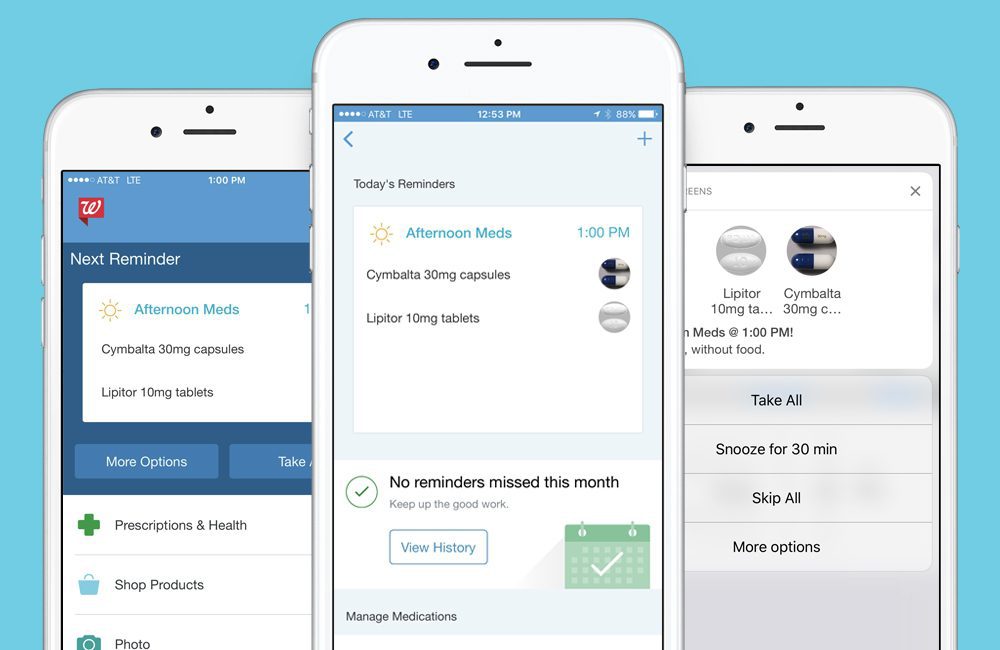
App Includes Touch ID, Pill Reminder Features Designed For Easy Navigation
The brand has built in various feature enhancements designed to better meet the needs and interests of these users, including:
Walgreens credits mobile pharmacyfeatures such as Pill Reminder and Refill by Scan as key drivers of the app usage: 37% of those utilizing these mobile pharmacy tools are 55+. By comparison, Forrester data shows that only 10% of smartphone owners who use health and wellness apps at least weekly are in that age demographic.
“This isn’t just a struggle within retail for those creating an app, but it’s trying to strike a balance between brand consistency and platform consistency,” Weiss noted. “On the brand consistency side, how much does your brand come through and how much do your styles and colors and everything that represents you influence what the user sees in the user interface? We err more on the side of platform consistency; we want enough brand in there so people can recognize you, but platform consistency is about using the patterns and the conventions, the buttons and the styles that are intrinsic to iOS and Android. When the consumer comes to your app, you don’t want them to relearn…you want them to use what’s already familiar.”