The retail market changed drastically over the past year, as people transitioned to more online shopping due to restrictions and safety concerns stemming from COVID-19. Now with a vaccine being rolled out and storefronts continuing to reopen across the country, there is a new awareness of personal safety concerns for people in public spaces. Retail owners will need to offer solutions to meet the latest set of guidelines — which includes universal cues to assist in social distancing without being distracting, obvious or non-approachable — if they want to attract customers. This is where the use of color can help.
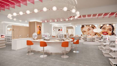
In 2021, color and design trends will help create retail environments that aid in customers’ confidence in the stores they shop in and their overall experience. As a result of the global pandemic, design considerations for retail include spatial flexibility, invisible service and cleanliness.
For example, large-scale plant installations and living wall murals can provide guests an immediate connection with nature, and offer natural barriers to create non-obvious social distancing. Sustainability also will be a focus area for retail, because customers expect an authentic approach and commitment to environmentally conscious decisions that align with their own values. Based on these trends and more, Sherwin-Williams is predicting four key trend palettes for the new year from its 2021 Colormix Forecast.
- Sanctuary
Shopping in-person again and reconnecting with the community are considered new forms of luxury right now — and soft, warm and tactile neutrals help bring a sense of calm, light and serenity to retail spaces. The Sanctuary palette features warm minimalist designs influenced by Scandinavian aesthetics. Its seamless styling is a key factor for creating an uplifting environment.
The warmth and versatility of neutrals such as Pure White SW 7005, Modern Gray SW 7632 and Morris Room Grey SW 0037 provide a haven for customers. Biophilic design, a key design feature in the Sanctuary palette and a crucial element in health and well-being, can be implemented using nature-inspired hues such as Oakmoss SW 6180, Antiquarian Brown SW 0045 and Canyon Clay SW 6054. - Encounter
More stores will continue to focus on the stories of their community, with well-considered, eye-catching moments built within the environment. When it comes to color, store owners can draw inspiration from the geography in which their shop is located. The Encounter palette helps owners provide layers of local character within the store.
For example, pair khaki browns like Hardware SW 6172 with other rich tones such as Naval SW 62444. Grays, greens and more mineral tones, such as Jubilee SW 6248 and Rosemary SW 6187, create a global color narrative and enhance the design experience. - Continuum
Smart living and technology are all around us and are crucial to any retail environment, but owners want them to blend seamlessly into the area around their customers. The Continuum palette is a mix of synthetic and natural colors helping to create this transition. Ocean depths are a source of inspiration for this palette, with blues taking on a trustworthy appeal that makes it so versatile for interiors.
Aqua and watery blue tones, such as Great Falls SW 6495, Commodore SW 6524 and Swimming SW 6764, bring a sense of serenity to a shop. For more minimalist style, light grays like Crushed Ice SW 7647 serve as the anchor neutral, and can be used tonally or with brighter pops of color like Novel Lilac SW 6836. - Tapestry
Finally, the Tapestry palette is about the resurgence of maximalism, yet with an approach that is more modern, curated and meaningful. This palette aims for the wow factor, whether through glowing surfaces, reflections or all-out joyful patterns, creating designed spaces that are camera-friendly while also encouraging escapism.
A group of uplifting colors — Jovial SW 6611, Cape Verde SW 6482, Enjoyable Yellow SW 6666 and Perfect Periwinkle SW 9065 — adds a sense of playfulness and excitement to a retail shop. Layer tints from this palette to add unexpected punchy accents throughout a store to bring mood-boosting hues and an artistic flair.
The way we experienced retail prior to the impact of the pandemic has changed, and will continue to evolve as 2021 unfolds. Design is only one of many aspects impacting the industry, but is one change that should be embraced. Color has the power to not only affect the overall aesthetic of a space, but how customers feel and experience a retail environment — a crucial component as people begin to visit businesses in person again.

Emily Kantz is the Color Marketing Manager in The Sherwin-Williams Company Color Marketing & Design Studio. She is a NCIDQ-certified interior designer focused on the commercial, hospitality and healthcare market segments. Kantz also holds an Evidence-Based Design Accreditation & Certification and has been in the design industry for 13 years. She is a member of the American Society of Interior Designers and an industry member of the International Interior Design Association.