Your site’s search box has an outsized role in buyer success. Did you know that approximately 40% of your visitors will use on-site search when they land on your site, but they account for 13% more revenue and convert nearly twice as much as non-searchers?
Site search often works very well when customers know exactly what they’re looking for — a specific brand or product like “Greenies dog treats” or “Ugg Classic Ultra boots.” These kinds of searches typically perform well on most sites.
However, if a search is broad it will be less successful because visitors will have many products to choose from. According to one study, ecommerce shoppers find what they’re looking for only 64% of the time on their first attempt. That’s a huge opportunity for improvement to drive conversions up and decrease bounce rates. One way to help is with filters or dynamic filters, also called facets.
Adding filters to an ecommerce site seems obvious, but it’s tricker than you might think. In fact, only 16% of sites studied by Baymard Institute did a good job. The other 84% of major ecommerce sites had poor filtering, or what Baymard called a “sad state of affairs.”
In the world of search filters, you’ve probably heard of a few terms. So we’re on the same page, I’ll define them briefly:
- Filters: Standard search filters work across your entire collection. For example, a filter for “shoes” or “T-shirts.”
- Facets: also called dynamic filters, facets change depending on the context of the search.
- Sorting: Sorting is not a filter, it’s a way to organize results in ascending or descending order.
In this article, unless I specify otherwise, I’ll be using the term filters to mean both static search filters and dynamic search facets.
Three Filter Trends
We’re seeing several trends in how companies are designing search filters. Some of these trends are a best practice, others are purely aesthetic — they’re how the brand wants to display filters and search results.
Top-of-the-page filters.
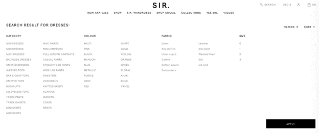
There’s a trend in ecommerce where more and more companies are displaying search results and filters above the fold.

Filters are typically located on the top or left side of the page. Baymard Research suggests that top filters are better for certain types of ecommerce sites — namely, those with a smaller number of filters — for two reasons:
- Visitors are more likely to not see filters on the left side of the page
- It avoids confusion with a sorting function (sort by popularity, price, newest, etc.)
Buyers tend to look for ways to sort product lists at the top of the page. If you have filters along the left and a sorting option on the top, users may miss the filters.
Mobile filters.

Mobile commerce sales are projected to reach a staggering $3.5 trillion in 2021. Responsive design isn’t a simple matter of resizing a few objects — it’s taking into account the entire buyer’s journey.
Some retailers have invested in both progressive web applications and native iOS or Android apps. Whichever direction you choose, designing for mobile will include a decision on how to integrate filters into the search experience.
Faceted search was originally designed for desktop use cases. Filters are more difficult to achieve on smaller screens — there simply isn’t enough space to show facets and results simultaneously.
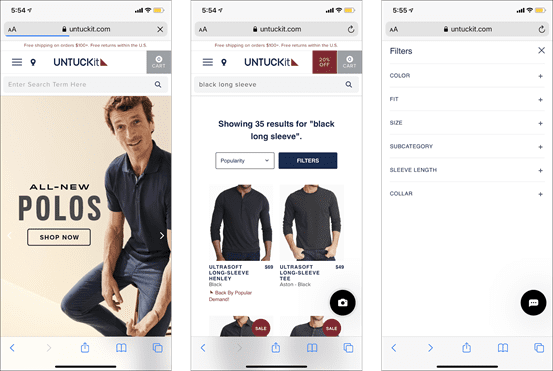
UNTUCKit has done a good job of building a mobile-friendly site with an easy-to-find search button right at the top of the screen. As I typed, the search bar displayed auto-suggested results. They offer both a convenient drop-down menu of common filters and a button for additional filters.
Search within filters.
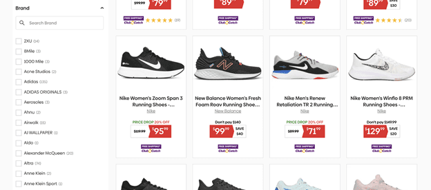
Some online stores have too many attributes and results to easily comb through. That’s why they’re adding search within their filters. In the screenshot below, I did an initial search for “running shoes” and, as you can see, the marketplace offered me a new search bar to winnow down brands.

Filters can become overwhelming and shoppers can easily forget which filters they selected or how to reset results. Filters at the top of the list will get the most attention. As a good rule of thumb, it’s best to display the most popular filter selections at the top. For really long lists, a search bar within your filter list allows for a better customer experience than manually browsing.
The Nielsen Norman Group has shown that when users are presented with too many choices, they can easily get frustrated and will bounce from your site. No doubt you’re looking to present the best possible experience for visitors on your site. Site search has come a long way in helping customers find what they want, but don’t forget the humble filter.
Filters have been around for a while, but getting it right isn’t always as straightforward or easy as you’d like. Hopefully, by adopting filter best practices, retailers can level up their site for a more successful — and profitable — customer experience.
Jon Silvers is head of marketing at Sajari where he writes about ecommerce site search best practices.


