Advertisement

Color Choices Maximize Impact Of In-Store Displays

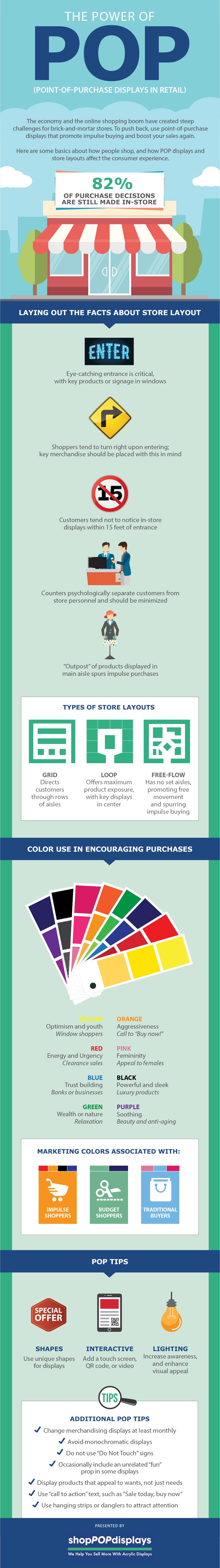
With digital channels continuously encroaching on brick-and-mortar sales, retailers need to maximize every in-store conversion opportunity. Point-of-purchase (POP) experts recommend matching signage and display colors to the appropriate product types and desired actions. Orange, for example, denotes aggressiveness and can be used to emphasize a “buy now!” message, while soothing purple is a good color choice for beauty and anti-aging products. Relaxing green encourages thoughts of wealth or of nature.

For more tips on making in-store displays more effective, check out this infographic from shopPOPdisplays.

[click to expand]

IG Criteo 1.31.17

Source: shopPOPdisplays

Retail Trendcaster Webinar Series
Days
Hours
Minutes
Seconds

Uncovering What’s Next in Retail

On-Demand Limited Video Series

Q1 is a pivotal time for retail, with experts analyzing holiday sales and forecasting trends. View the full lineup of the Retail Trendcaster video series for insights on consumer spending, AI, personalization, social commerce, and more—helping you focus on what truly matters in 2025.

Brought to you by
Retail TouchPoints
Access Now
Retail TouchPoints is a brand of Emerald X LLC. By clicking the button and submitting information, you acknowledge and agree that your information may be shared with corporate affiliates of Emerald X LLC, and other organizations such as event hosts, speakers, sponsors, and partners. Please read our Privacy Policy and our Terms Of Use for more information on our policies.

Access The Media Kit

Interests:

Access Our Editorial Calendar


If you are downloading this on behalf of a client, please provide the company name and website information below: