
 In today’s hyper-connected world, Web and mobile application performance is playing an increasingly critical role in driving retail customer engagement. Consumers have higher-than-ever expectations — they want pages to load fast and they expect rich and engaging experiences across all touch points along their buying journeys.
Keeping pace with the fast-growing, mobile phenomenon and its global implications is both a challenge and a prerequisite for retail success. Retailers who fail to innovate to meet — and exceed — these consumer expectations risk losing a large and growing portion of the business in their highly competitive markets.
Below I’ve outlined key steps to delivering an optimal mobile experience.
Optimizing Web Experiences With Responsive Web Design
Limitations Of RWD
One of the challenges associated with larger, more complex RWD-developed pages is that they need to be delivered to end-users’ browsers, which then process and render them. If a customer has a mobile device with limited computing power, connected over a high latency, low bandwidth cellular or wireless network this can negatively affect the user experience.
Below is a snapshot of an end-user’s experience when visiting a U.S. retailer’s homepage on a variety of different devices/networks, designed with RWD. The conclusion is obvious. The delivery of a relatively small 700KB RWD site works ok for users on cable networks and PCs but on a mobile device, over wireless networks, resulted in serious performance shortcomings.
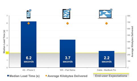
FIGURE 1 Example RWD site does not meet end-users’ performance expectations
End-users don’t think about, nor care about the technological challenges required to deliver quality experiences to an array of devices over wireless and cellular networks, they just want sites to load fast and work as expected.
There are a variety of options available to help developers overcome the challenges associated with delivering heavy RWD sites. For example, with wireless networks moving content as close to the end-user as possible through a Content Delivery Network (CDN) can be effective, as well as leveraging optimal delivery mechanisms such as SPDY, an open networking protocol for transporting Web content. It’s important to also focus on the components of the Responsive Web Design application: the HTML, images, JavaScript and CSS objects. The below explores these factors in more detail.
Reducing Round Trip Time
One seemingly obvious fact — the fastest request is the one that isn’t made. Each HTTP request and server response combination represents at least one round-trip on the network. Depending on where the end-user is located in proximity to the origin server, a single round-trip request can take multiple seconds to complete. A single Web page can require dozens of HTTP requests before it can render content, with requests often delaying one another due to the number of connections limited by the specific browser. There are several techniques to eliminate unnecessary requests such as consolidating multiple CSS and JavaScript files, in-lining small images and leveraging new caching features in HTML5.
Delivering Fewer Bytes
The larger a Web page (measured by bytes), usually the longer it will take to deliver over a constrained network, and the longer it will take a browser to process and render the content. Images are definitely an issue for RWD sites. Keep file size in check by adjusting image formats, improving cache management, compressing files, and removing data such as comments, whitespaces and image metadata. Automated solutions exist to help deliver the right image resolution to the right device and avoid excessively large images, maintaining image quality at the edge of what the user can perceive, for both small and large screens. For example, such a solution can optimize a page to only load the images that are visible within the current view. As the user scrolls down, the page loads new images on demand, which helps reduce load time.
Improving Perceived Performance
Processing a Web page is a complicated process. Browsers make complex decisions such as which files to download serially versus in parallel and how to manage their connections. At the same time, they need to execute complicated codes, which are often not well defined. Unfortunately, the browser doesn’t know sites in advance and is forced to employ generic logic when processing a page. This logic changes between old and new browsers, is limited by backward compatibility and is not customized to a site. Accelerated rendering techniques like deferring print style sheets, keeping social buttons from blocking rendering and prefetching the next page are ways to guide the browser into doing the right thing. As a result, users receive a truly fast experience, attuned to their needs.
Conclusion
Delivering fast RWD sites is not necessarily easy and requires considerable expertise and resources, and few organizations have expertise in-house to take this on. The first step to delivering a fast, quality RWD site is to understand the likely experience you will be delivering to your end-users. Because in the end you can’t optimize what you can’t measure. In addition having content located as close to end-users as possible, and routing requests back to your datacenter/cloud provider while reducing application requests, bytes and accelerating rendering can significantly improve your customers web experiences. . Retailers’ websites need to keep up with the changing tides, and having a RWD site can help accelerate Web performance and improve mobile engagement which will in turn, increase sales.
Lorenz Jakober is the senior product marketing manager at Akamai. Jakober brings a wealth of experience focused on web and mobile application design, performance optimization, usability, and delivery to his role as Senior Manager. Prior to joining Akamai Technologies he drove mobile product marketing strategy and the complexity at the edge theme for Compuware Gomez. In past positions Jakober focused on customer acquisition, retention, and market research at mobile application delivery platform and media companies. He is an avid spokesperson and blogger on the topic of mobile and web performance and has recently been featured in industry publications including Mobile Commerce Daily, VentureBeat, PC World, Digiday and MediaPost.